
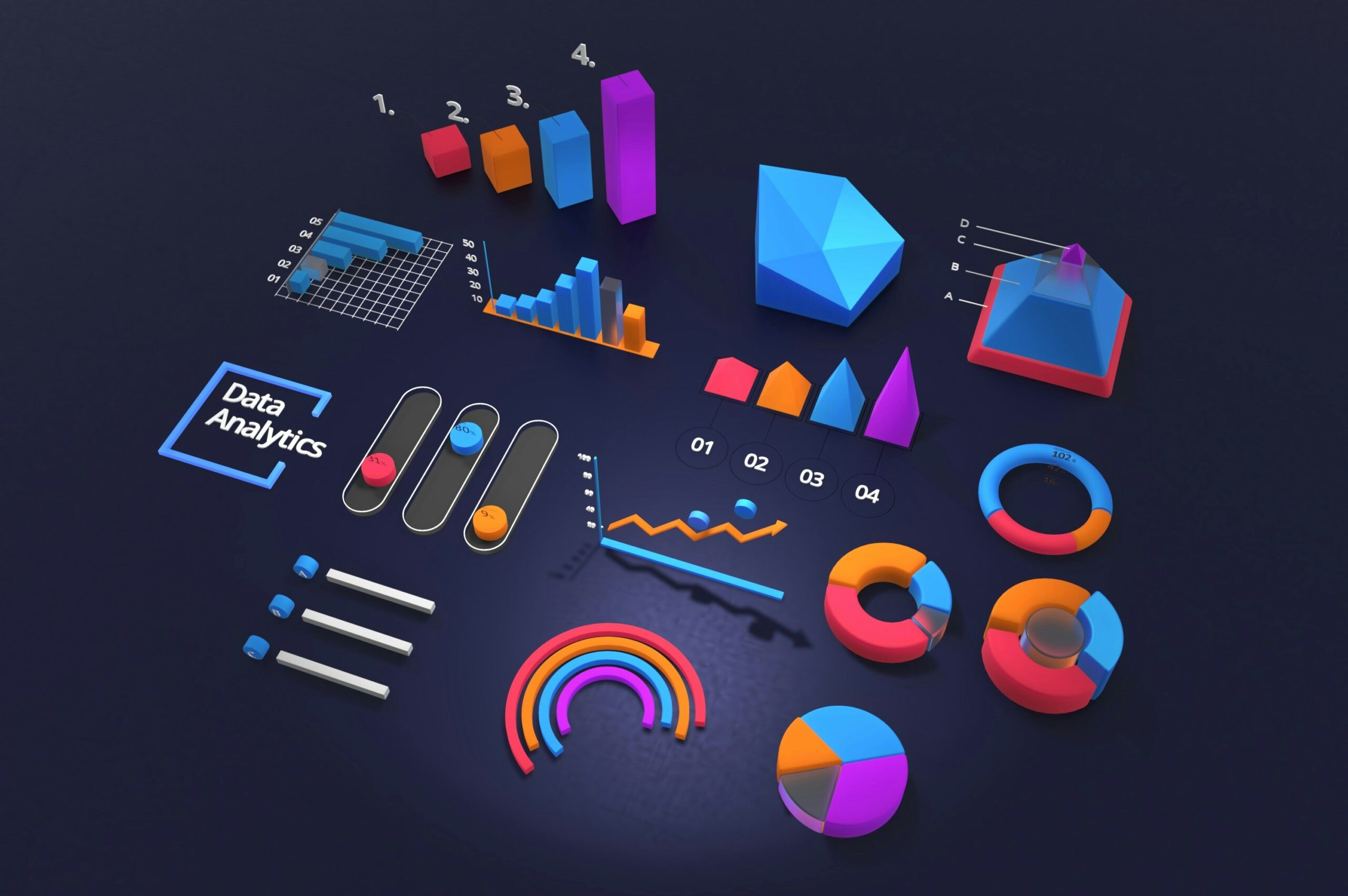
AI Dashboard Management Tools: Automate Insights, Save Hours on Reporting
AI dashboard management tools: Modern teams are drowning in dashboards. Between performance metrics, sales KPIs, marketing analytics, and financial reporting, managers easily lose hours every week updating charts, extracting insights, and preparing presentations.
AI dashboard management tools solve this problem by automating the entire workflow—data syncing, visualization, analysis, and reporting—so you can focus on decisions, not manual work.
What Are AI Dashboard Management Tools?
AI dashboard management tools are platforms that use artificial intelligence to automate the creation, maintenance, and analysis of dashboards.
They go beyond static charts by:
- Automatically collecting and cleaning data from multiple sources
- Generating dashboards without complex setup or manual modeling
- Highlighting trends, anomalies, and opportunities using AI
- Producing reports and summaries on autopilot
- Sending alerts when metrics move in the wrong direction
Instead of spending Sunday night updating spreadsheets and screenshots, your dashboards are always up to date and already interpreted for you.
Why Businesses Are Switching to AI-Powered Dashboards
Teams are moving from traditional BI tools and manual reports to AI dashboard management tools for a few brutal reasons: time, accuracy, and clarity.
1. Zero Manual Updates
Once you connect your data sources—Google Analytics, HubSpot, Salesforce, Stripe, Shopify, spreadsheets—AI dashboards sync and refresh automatically.
No more exporting CSVs, rebuilding charts, or chasing “the latest version” of a report.
2. Instant Insights Instead of Raw Numbers
Classic dashboards show you numbers. AI dashboard tools tell you what those numbers mean:
- “Your conversion rate dropped 12% this week, mainly from paid search traffic.”
- “Churn increased for users on the basic plan after the last pricing change.”
- “Facebook ROAS is trending down; TikTok is trending up.”
That shift from raw data to clear narrative is where AI dashboard management tools earn their keep.
3. Automated Reporting
Instead of building presentation decks every week or month, AI tools generate:
- Executive PDF reports
- Email summaries with key metrics
- Slack or Teams updates
- KPI snapshots for leadership
You review, adjust, and send—rather than manually building everything from scratch.
4. Forecasting Built In
Many AI dashboard platforms include predictive models that estimate:
- Future revenue and MRR
- Lead volume and CAC
- Customer churn risk
- Inventory and demand
That saves analysts from building one-off forecasting spreadsheets that no one maintains.
5. Collaboration Without Spreadsheet Chaos
AI dashboards provide a single source of truth. You share links and role-based access instead of emailing fragile Excel files and static screenshots.
Best AI Dashboard Management Tools in 2025
Here are some of the strongest AI dashboard management tools available today, based on automation level, insight quality, and ease of use.
1. Polymer
Best for: marketing teams, e-commerce brands, operations
Why it stands out: Polymer can turn almost any data source or spreadsheet into an interactive dashboard in a few clicks.
- Instant dashboard creation from CSVs, Google Sheets, or imported data
- AI suggestions for segments, trends, and filters
- No-code chart building
- Great for quick marketing and product analytics
2. Causal
Best for: finance teams, founders, FP&A
Why it stands out: Causal combines dashboards, forecasting, and scenario modeling into a single AI-assisted tool.
- Financial models that auto-update from your data
- Scenario simulations (best case / worst case)
- AI-generated explanations for variances and trends
- Perfect for board reports and investor updates
3. Klipfolio with AI Assist
Best for: real-time KPI monitoring
Why it stands out: Klipfolio connects to 100+ services and now uses AI to interpret and explain what’s happening in your metrics.
- Data syncing with marketing, sales, and product tools
- AI commentary on dashboards
- Alerts when key thresholds are hit
- Sharable dashboards for clients and stakeholders
4. Microsoft Power BI with Copilot
Best for: enterprises and data-heavy organizations
Why it stands out: Power BI is already a BI powerhouse; adding Copilot gives you natural-language dashboard creation and explanations.
- Ask Copilot to build visuals from your data model
- AI summaries of performance and trends
- Deep integration with Microsoft 365 and Azure
- Great for centralized analytics teams
5. Tableau with Pulse
Best for: organizations already using Tableau
Why it stands out: Tableau Pulse is an AI layer that pushes personalized insights directly to each user.
- AI-generated narratives for key metrics
- “Feed” style view of what changed today
- Deep visual customization
- Ideal for data-mature companies
6. Databox with AI Features
Best for: agencies and SaaS teams
Why it stands out: Databox focuses on KPIs and now adds AI scorecards and performance digests.
- Prebuilt dashboards for common tools
- AI summaries of weekly performance
- Client-ready reports by email
- Great when you manage many accounts
How to Choose the Right AI Dashboard Tool
Not every business needs enterprise-level BI, and not every startup needs a complex data warehouse.
Use these criteria when choosing between AI dashboard management tools:
- Data sources: Does it connect easily to the tools you already use?
- Insight quality: Does the AI provide useful explanations, or just surface obvious changes?
- Automation level: Can it generate dashboards for you, or do you build everything manually?
- Forecasting: Does it offer predictive analytics if you need planning and budgeting?
- Collaboration: Can stakeholders comment, share, and subscribe to dashboards?
- Ease of use: Can non-technical team members use it without training?
AI Dashboards vs Traditional Dashboards
Here’s how AI dashboard management tools compare to traditional BI dashboards and spreadsheet-based reporting:
| Feature | Traditional Dashboards | AI Dashboard Management Tools |
|---|---|---|
| Data Updates | Often manual / scheduled | Automatic, near real-time |
| Insight Generation | User must interpret charts | AI explains trends and anomalies |
| Reporting | Manual slide decks and exports | Auto-generated PDFs and email summaries |
| Forecasting | Basic or external models | Built-in predictive analytics |
| Setup Time | High (models, ETL, dashboards) | Low (templates + AI-generated views) |
Real-World Example: How AI Dashboards Save Hours Every Week
Imagine a marketing manager handling paid ads, email, and content performance. Previously, every Monday looked like this:
- Exporting data from ad platforms and analytics tools
- Cleaning and merging spreadsheets
- Updating charts in Google Data Studio or PowerPoint
- Writing a summary email for leadership
Total time: 4–6 hours per week.
With an AI dashboard management tool in place:
- Data sync is automatic
- The dashboard is always up to date
- AI generates a weekly performance summary with highlights
- A PDF or email report is scheduled for stakeholders
Total manual time: 20–30 minutes—just enough to review, adjust messaging, and plan next actions.
Who Benefits the Most from AI Dashboard Management Tools?
These tools are especially valuable if your work depends on recurring reports and KPI tracking. The biggest winners are:
- Marketing teams managing multi-channel campaigns
- Sales and revenue operations teams
- Finance and FP&A teams needing rolling forecasts
- Founders and startup teams without full-time data analysts
- Agencies reporting to multiple clients every month
- Product teams tracking feature adoption and user behavior
Final Thoughts: AI Dashboards Are the Future of Reporting
AI dashboard management tools are not just a shiny add-on to existing analytics—they are quickly becoming the standard for how modern teams consume data.
By automating data collection, visualization, insight generation, and reporting, they free up hours every week and give you clearer answers to the most important question:
“What should we do next?”
If you’re still buried in spreadsheets and manually updated charts, testing one or two AI dashboard tools is one of the highest-leverage experiments you can run this quarter.
Read also : AIproductivity for project managers : The Pillar Guide to Working Smarter